Tile
Color
| Element | Property | Color token |
|---|---|---|
| Tile:background | background-color | $layer * |
| Tile border | border | $border-tile * |
| Icon | svg | $icon-interactive |
| Checkbox icon | svg | $icon-primary |
| Checkmark icon | svg | $icon-primary |
| Chevron icon | svg | $icon-primary |
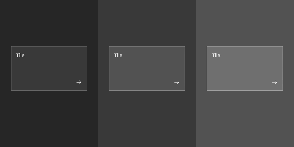
The example shows layering tokens applied across layers in the Gray 100 theme.
Interactive states
| Element | Property | Color token |
|---|---|---|
| Tile:hover | background-color | $layer-hover * |
| Tile:focus | border | $focus |
| Tile:selected | border | $border-inverse |
| Tile:disabled | border | $border-disabled |
| Icon:disabled (or pictogram) | svg | $icon-disabled |
| Text:disabled | text color | $text-disabled |
Base tile
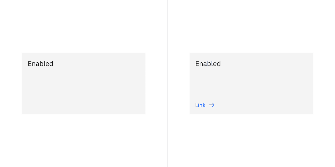
Base tile doesn’t have a border. It’s not interactive, but can have interactive elements. Base tile only has the enabled state.
Clickable tile
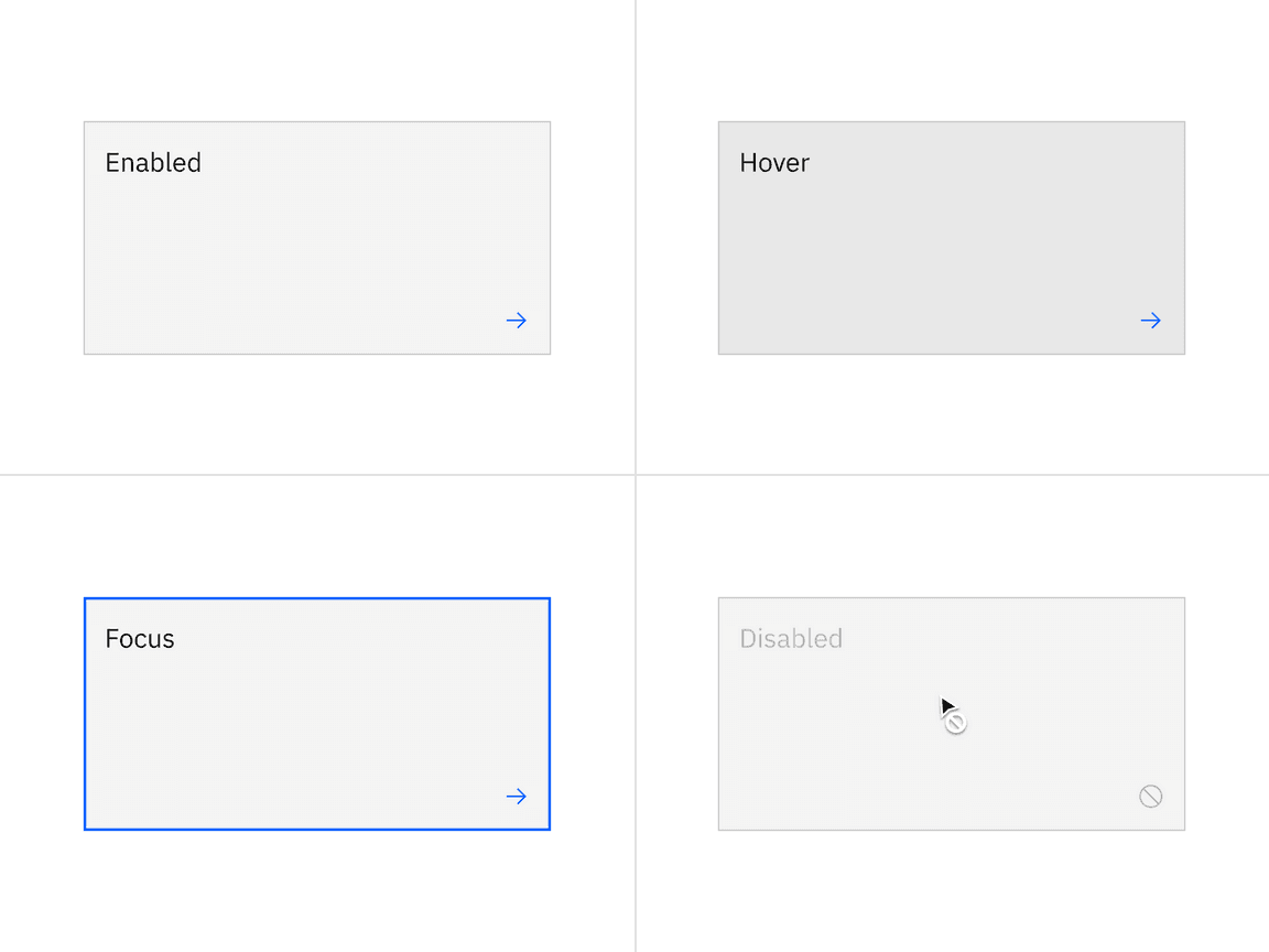
Clickable tile has four states: enabled, hover, focus, and disabled.
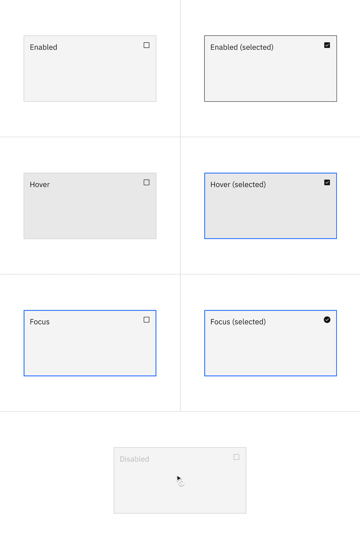
Selectable tiles
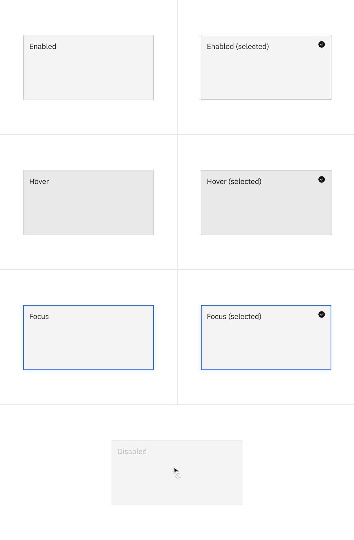
Selectable tiles have five states: enabled, hover, focus, selected, and disabled.
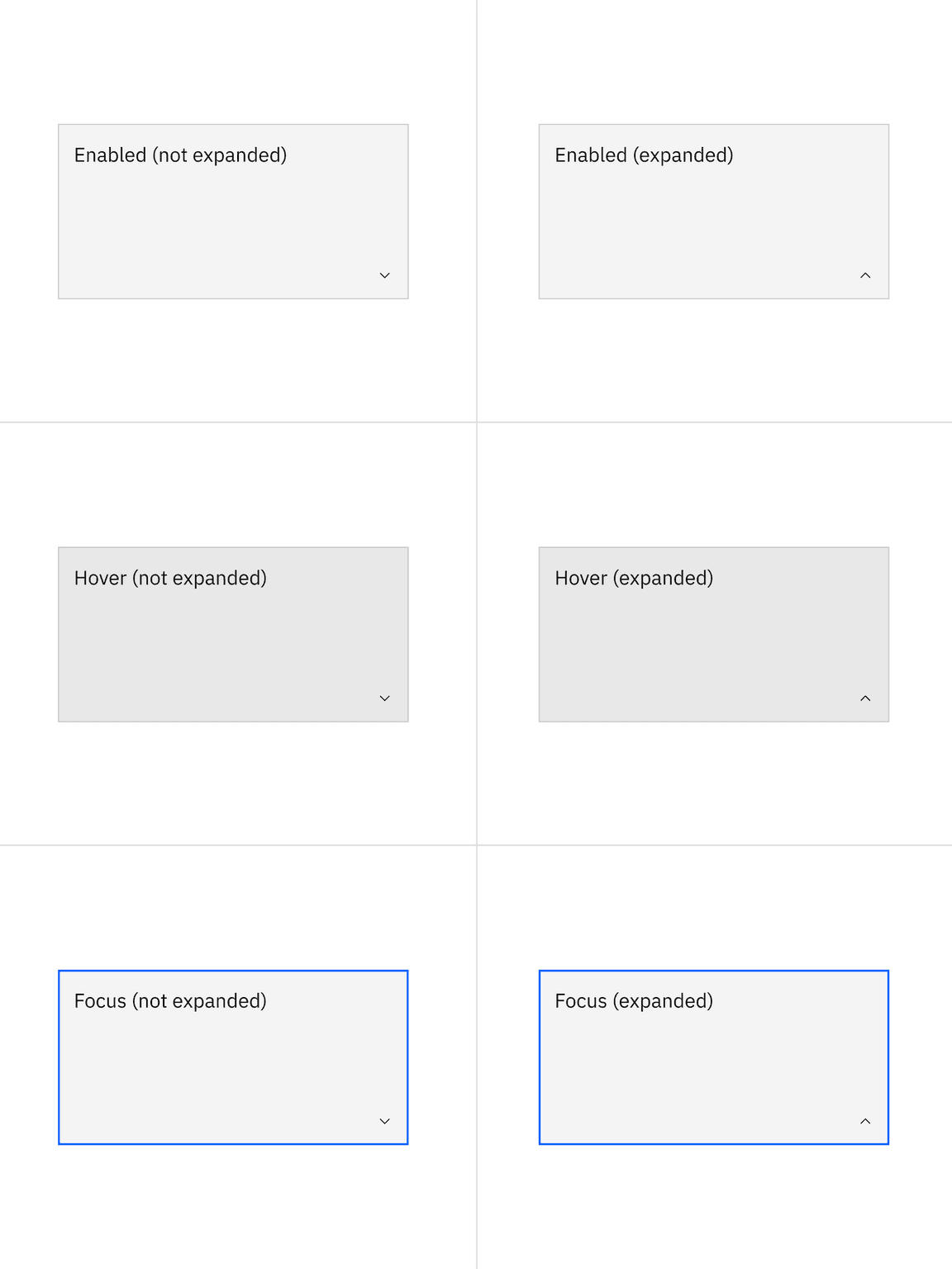
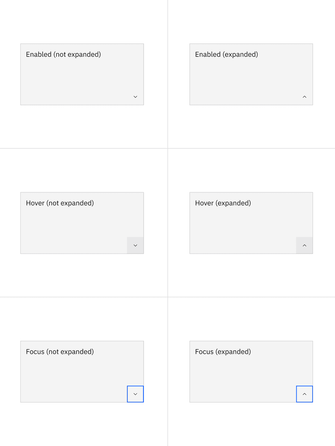
Expandable tiles
Expandable tiles have three states: enabled, hover, and focus.
Structure
| Element | Property | px / rem | Spacing token |
|---|---|---|---|
| Tile | min-height | 64 / 4 | – |
| min-width | 128 / 8 | – | |
| padding (minimum) | 16 / 1 | $spacing-05 |
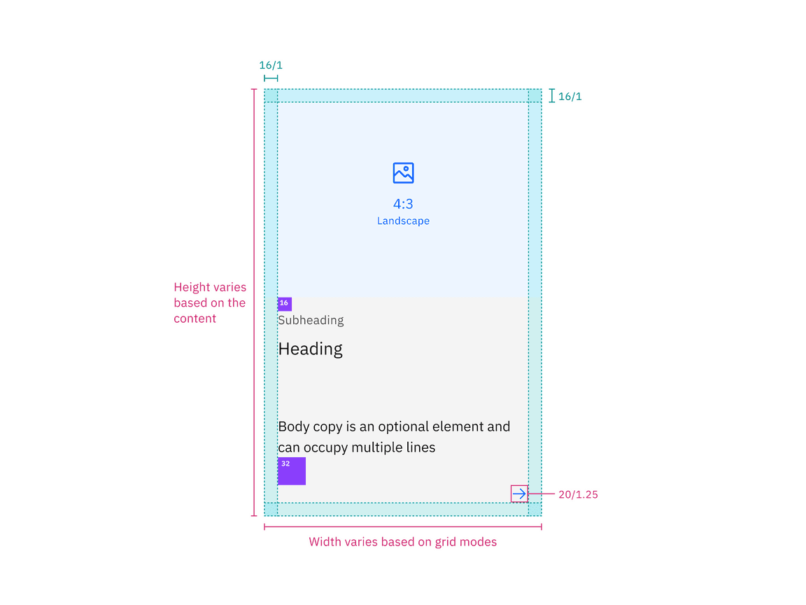
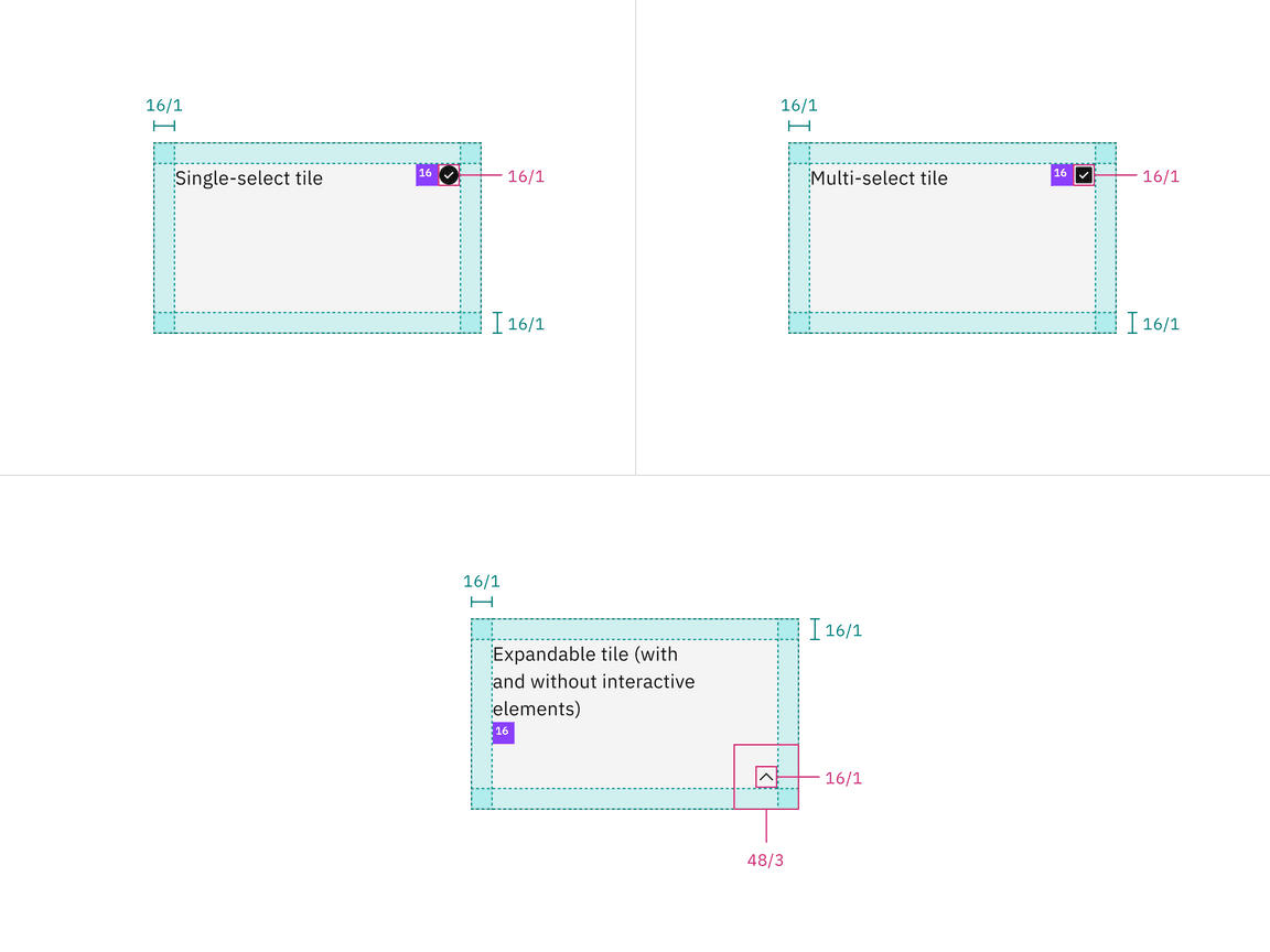
Structure and spacing measurements for tile | px / rem
Proportions for grid
| Percentage | XL 1600-1200 | L 1200-992 | M 992-768 | S 768-576 | XS 576-0 |
|---|---|---|---|---|---|
| 100% | |||||
| 1/2 | |||||
| 2/3 | |||||
| 1/3 | |||||
| 1/4 | |||||
| 1/6 |